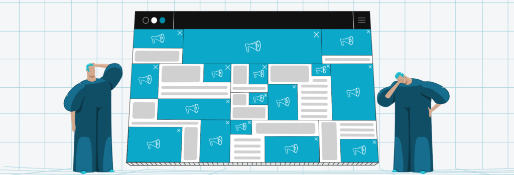
7 Tips to Improve User Experience with Ads
We hear a lot about how to improve user experience these days. Ultimately, with Google’s Page Experience update and Core Web Vitals, user experience is the most important SEO factor.
But the burning question for all digital publishers is–can you achieve a great user experience if you’re showing ads? And the answer to that is yes, you can!
What is User Experience, and Why It’s Important?
User experience (UX) is the process of addressing users’ needs and wants by improving the usability, accessibility, and functionality of your website.
Publishers displaying ads on their website should pay special attention to their UX because ads can negatively affect users’ behavior. When users feel that ads disrupt their experience with the website, they become dissatisfied and go somewhere else. Publishers are the ones losing ad revenue.
Below are 7 tips that will help you improve your UX when showing ads.
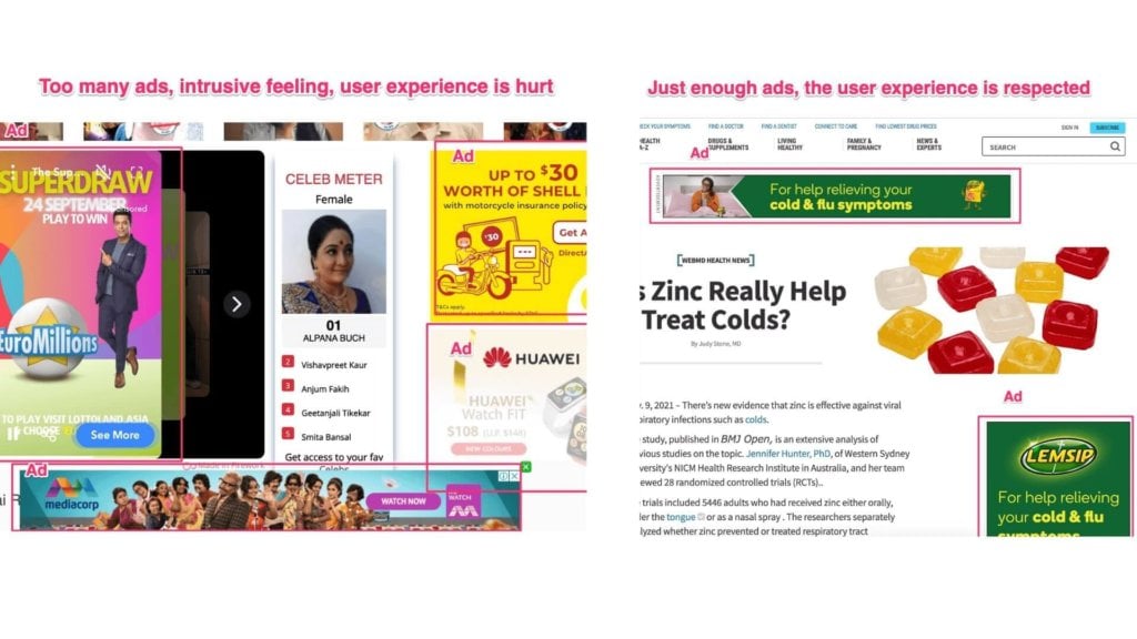
1. Don’t Overcrowd Your Website With Too Many Ads
Publishers often think adding more ad placements will lead to more ad revenue. However, usually, it’s the opposite because too many ads can lead to low CTRs and ad engagement, and poor ad viewability.
Not only does ad inventory become less valuable, but the user experience suffers. There’s nothing more annoying than a slow-loading website with tons of ads.
The optimal ad to content ratio depends on the length of the content, layout, and user behavior. But as a general recommendation, your ad density shouldn’t exceed 30% to 70% content.
It’s better to use fewer ads but experiment with more ad formats and placements. Don’t be afraid to change your ad placement strategy from time to time.
2. Reduce Layout Shift
Ads are one of the main offenders when it comes to layout shifts. Layout shift happens when a visible element on your page changes position or size, causing your content to shift or break completely.
In fact, this metric is so important that Google has it as one of its three Google’s Core Web Vitals signals–CLS or Cumulative Layout Shift.
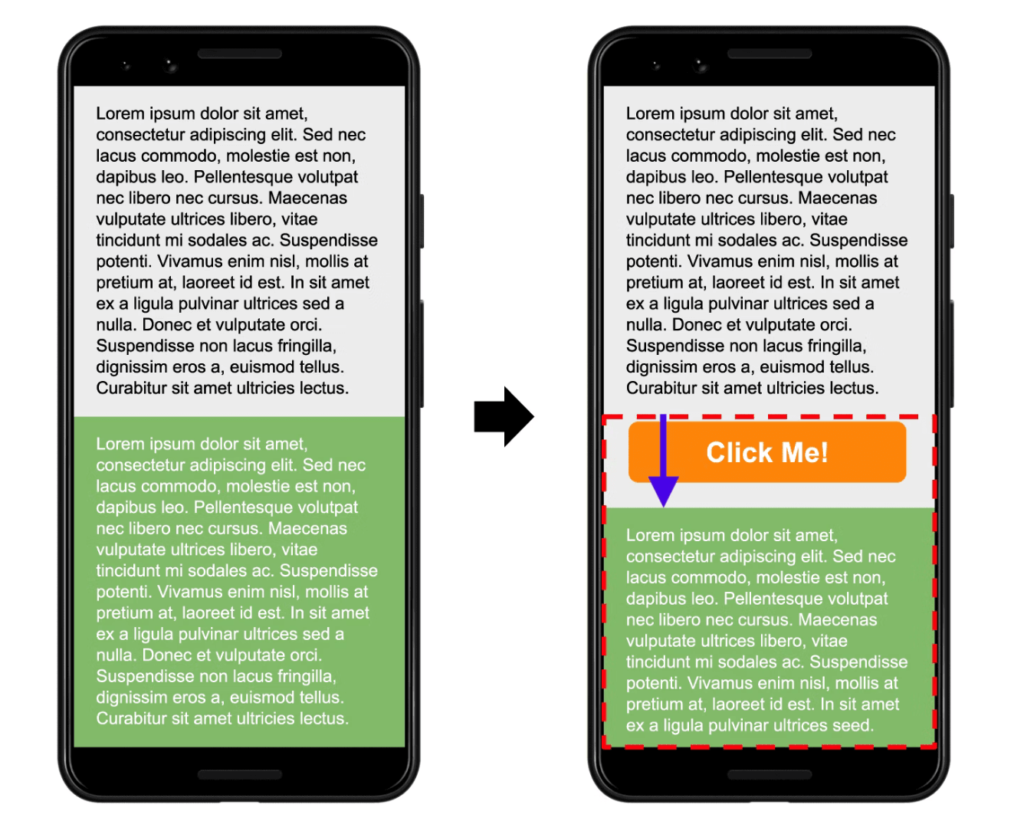
Source: web.dev
To avoid layout shifting caused by ads:
- Set a fixed height for ad units. It will prevent layout shifting, particularly on long article pages or single-page applications. It’s recommended to reserve the largest possible size for the ad slot so that any smaller ads can also be delivered in it.
- Choose the most likely size for the ad slot based on historical data.
- Make sure you reserve enough space for the ad slot when placing ads near the top of the viewport.
3. Use Non-Intrusive Ad Formats
Intrusive ads are the main reason people utilize ad blockers. Intrusive ads interrupt the user’s natural flow and ruin their experience with your website, which results in a higher bounce rate and less ad revenue.
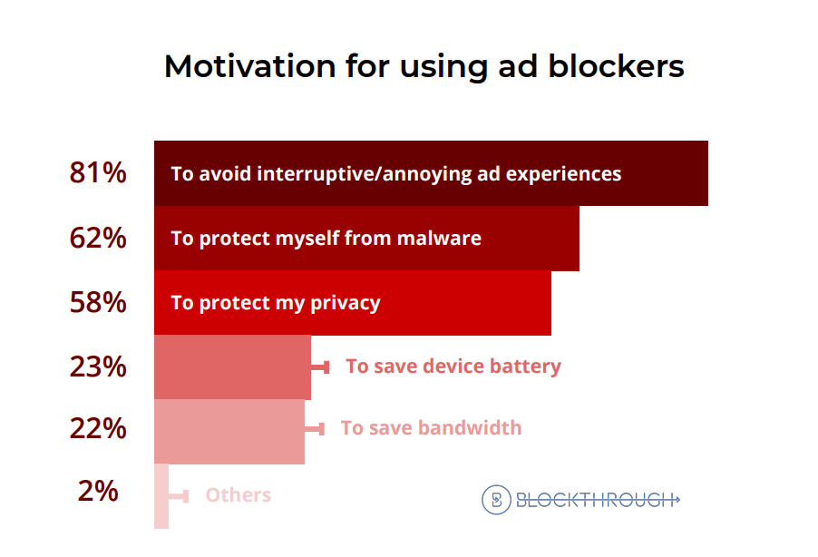
Source: Blockthrough
However, not all ads are made equal. With the right ad formats and ad density, you can deliver a superb user experience.
Try the following tips:
- Replace annoying ad formats with less intrusive ones. For example, replace pop-up ads with interstitials. Interstitial ads only appear only when a user takes action and have a built-in frequency capping of one interstitial ad per user in an hour, whereas pop-ups don’t have this feature.
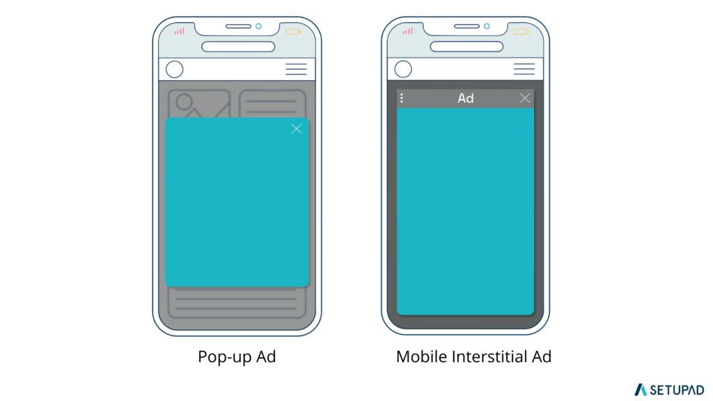
- Avoid intrusive ad formats as outlined by the Better Ads Standards.
- Use ad formats that users can engage and interact with, like rich media ads or outstream video ads.
Pro tip! Go to https://www.google.com/webmasters/tools/ad-experience-unverified and run the Ad Experience Report for your website. The Ad Experience Report will give you an idea of which ad-related issues cause bad user experience. For example, your ad density can be too high, or you can have violating ad formats.
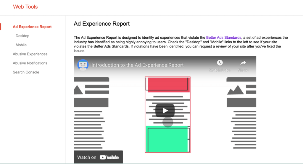
4. Avoid Accidental Clicks
Accidental clicks aren’t just annoying for the users. Google treats a high number of accidental clicks as invalid clicks.
As a result, it can lead to so-called Google’s two-click penalty, where Google places a “Visit Site” button on top of the ad after the visitor first clicks on it. This normally results in a big ad impression and CTR drop.

Source: Google
However, a smart website design can solve the problem of accidental clicks. For that, you need to:
- Test your website on smaller devices to ensure website design won’t lead to accidental clicks.
- Maintain a safe margin between content and ads–your banners should have a padding of 10px as a minimum.
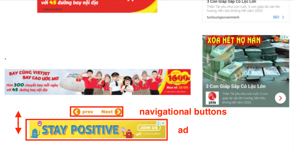
- Do not place ads too close to navigation buttons/links.
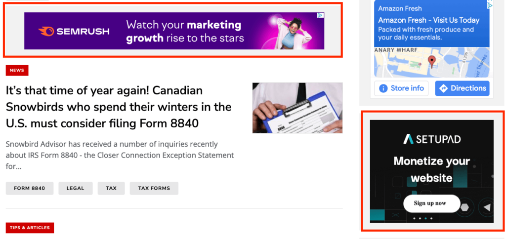
- Don’t disguise ads as content. This goes against Google’s policies and might result in Google suspending you from showing ads. The ads should be clearly visible and distinguishable from the rest of the content.
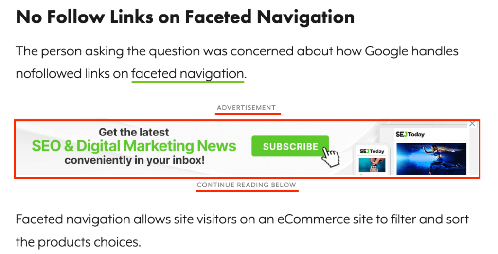
5. Improve Ad Viewability
It might sound counterintuitive, but ad viewability adds a ton of value to your ad revenue and user experience.
See, users are prone to banner blindness, whereby people ignore ads they see. Users usually see too many ads online, so their eyes are trained to omit placements where ads are likely to appear.
By improving ad viewability, you help users to get a more meaningful experience where they can clearly see your ads and interact with them if they want to. Usually, a good way to do this is to opt for non-intrusive advanced ad formats with high ad viewability, like sticky and native ads.
If you have a website with a lot of content (like a news website), you might benefit from techniques like infinite scroll, which is a pattern when the content is continuously added to the page as a user scrolls. That way, you can hook the reader in for longer and show him more ads within a single session.
Infinite Scroll Example
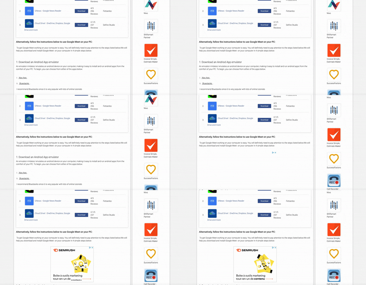
Another technique you might try is lazy loading for ads. With lazy loading, the ad is displayed right when your viewers are likely to see it.
Lazy Load Example
6. Improve Ad Load Time
Ads are built using JavaScript codes which naturally contribute to page latency. High page latency harms the website’s loading speed and user experience, that’s crucial for Core Web Vitals.
To improve the ad load time, you should:
- Try lazy-loading, especially for ads below-the-fold. That way, ads that aren’t visible to the screen won’t be loaded immediately and won’t cause extra execution time.
- Use header bidding wrappers that load third-party scripts asynchronously. With asynchronous loading, all bid calls are sent to demand partners concurrently when the page is requested, resulting in faster page and content loading.
- Use lighter ads, like AMP ads. These mobile ads are faster by design and can be especially useful for users on slower Internet connections.
- Use server-to-server header bidding wrapper. Server-to-server header bidding loads outside the user’s browser and ensures a much faster connection.
7. Partner With a Monetization Platform
There are many benefits to partnering with a monetization platform. One unbeatable advantage is a competitive header bidding technology that allows publishers to earn more money with fewer ad placements.
A monetization platform like Setupad has high standards when it comes to user experience. We take care of it by displaying only Better Ads Standards-compliant ad formats while our experts advise each client on the best ad formats and ad placements strategy for his website.
In addition, we help to avoid layout shifts by using fixed ad placement in above-the-fold (ATF) positions, which have the biggest impact on CLS.
Final Words
Note that your overall website design and usability are a big part of user experience. Core Web Vitals are signals that are based solely on data from real users, so your goal here shouldn’t just be to optimize your website for better SEO but address the abilities and needs of your users.
Google also considers metrics like responsiveness and smoothness, so you should look at the big picture and assess how delightful people use your website. Ask your visitors to give you feedback and constantly analyze and experiment with your ad strategy.
Do you have any more tips to add to this list? Email them to us at [email protected].
