Where to Place Ads on Your Website? | A Guide for Publishers
Choosing the best ad placement for your website is a tedious process. You have to consider many different factors like ad viewability, user experience, ad size, and more. Without a basic understanding of web design and experience, this can be challenging.
In this article, we’ll cover optimal ad placements for your website, tips for choosing the best place for ads, ad placement examples, as well as top-performing ad sizes.
Let’s dive in!
What is a Website Area, and Why It’s Important?
It’s an area where the primary content of your webpage resides. Your website is divided into two key areas–above the fold (ATF) and below the fold (BTF).
When it comes to choosing the best ad placement on the website, you need to first assess the landscape of your website and consider some key website area rules. Why?
Because placing ads in the right places can make them more viewable. It’s important because advertisers use ad viewability to determine how likely someone is to see your ad.
Typically, they’re willing to pay more for ad placements in viewable positions. Therefore, more viewable ads can boost your eCPM and overall ad revenue.
Now let’s go over these 2 website areas in detail.
Above The Fold (ATF)
Above the fold (ATF) refers to the area on your website that the user sees when he opens your webpage. Above-the-fold placements usually have higher ad viewability than below-the-fold.
According to a study by Google, ATF video ads were found to be 73% viewable, while BTF were only 45% viewable.
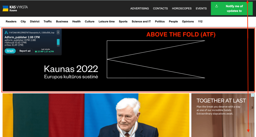
Being seen more often means users are more likely to interact with your ads, which is why ATF ads have a high advertising demand. However, it’s important not to overcrowd your website with too many ads in ATF positions. Not only can Google penalize you, but it can also result in a negative user experience and increased bounce rate.
It’s also recommended to make the most of your above-the-fold content so that users can interact with it before they start scrolling down and engaging with your ads. This can be done by using wider and shorter page design.
When it comes to ATF ad placements, the most important thing is to make sure that the ads load as fast as possible. That’s because when users land on your page, they immediately start scrolling. If ads don’t load fast enough, they may never get seen.
Therefore, it’s not recommended to place ads right at the top of your page. Consider moving banners below the navigation bar or near the bottom of the screen (above the fold).
In the example below, the ad is pushed almost near the bottom of the page in above the fold position.
Below The Fold (BTF)
Below the fold (BTF) refers to the portion of the screen that a user needs to scroll to see. To maximize the effectiveness of BTF ads, you need to create content that entices the user to scroll down.
Setupad experts recommend using a lazy-loading technique for below-the-fold ads. With this technique, the ad load is delayed until the banner is in view, which means ads outside the viewport won’t be loaded until they are nearly on-screen.
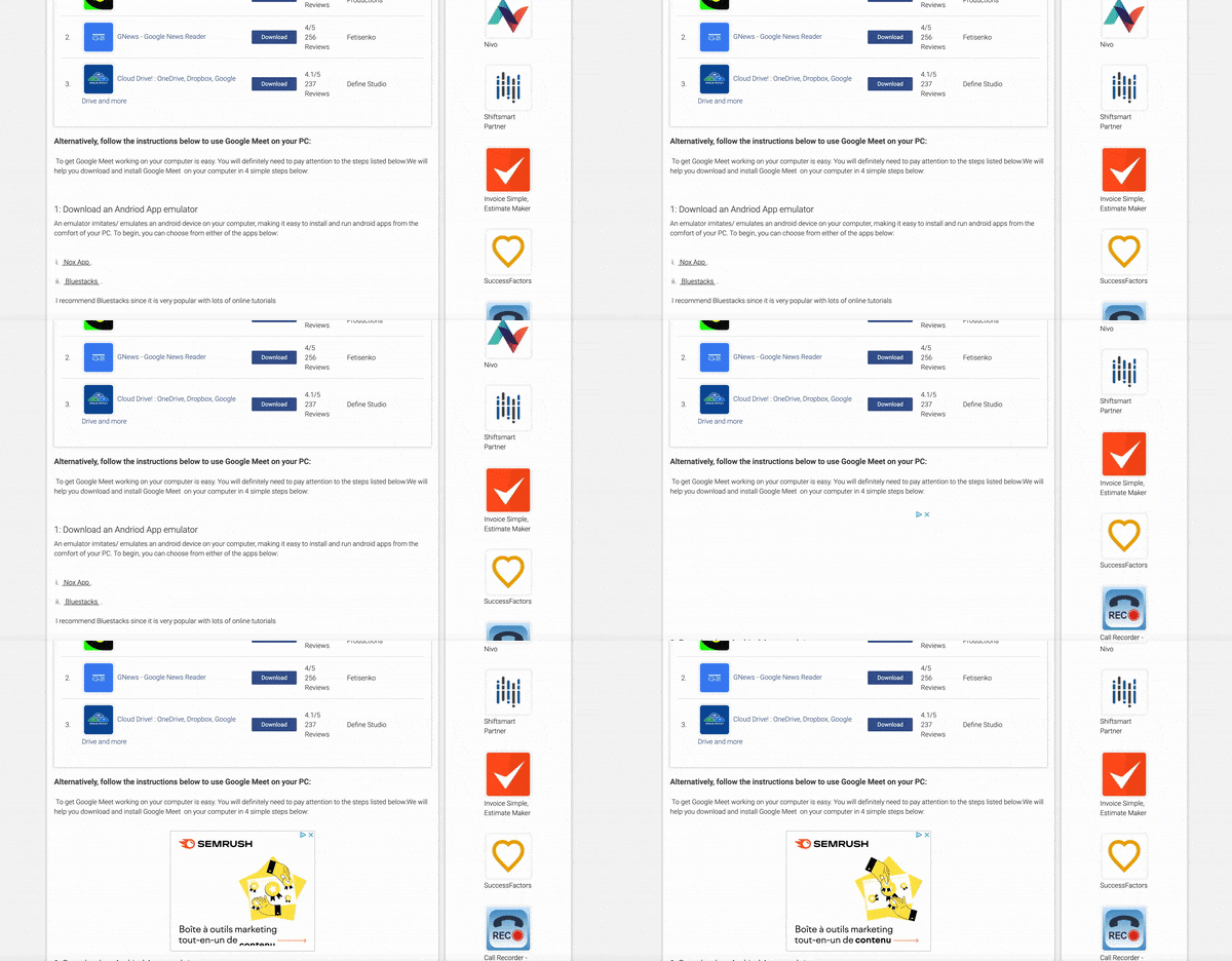
It’s also recommended to place BTF ads on the side of the page (sidebar banner). That way, you’re not interrupting the user from viewing the main content.
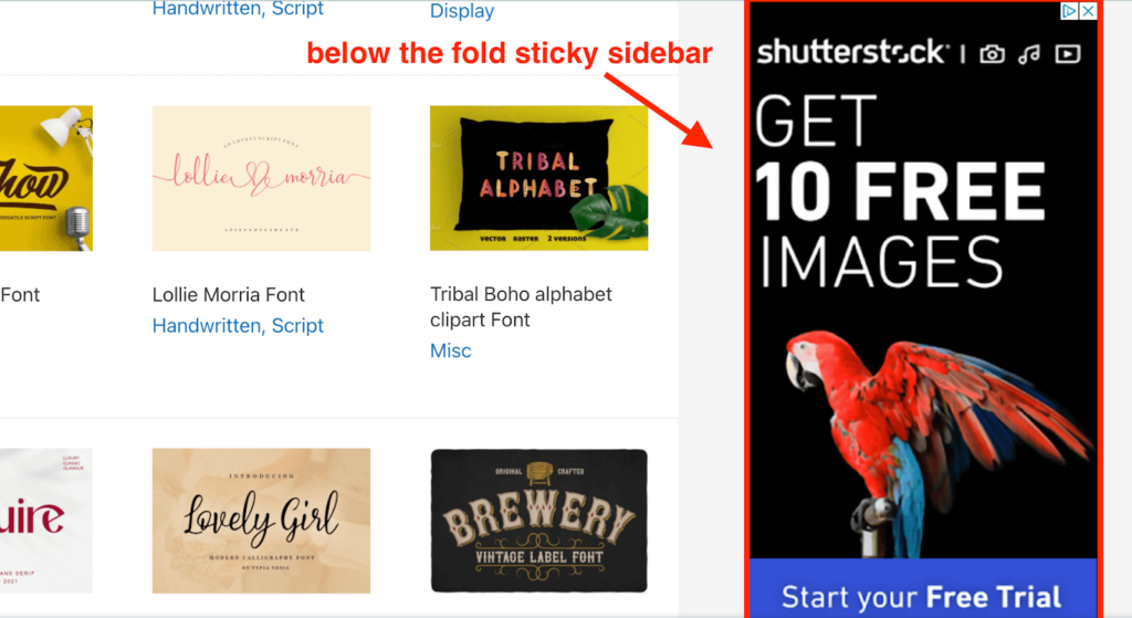
In addition, sidebar ads stay on the screen for a longer period of time rather than banners placed within the content. The most popular ad placement example for BTF ads would be either a vertical or square sidebar banner.
For long-form content, publishers can benefit from techniques like infinite scroll, whereby the user keeps scrolling but never reaches the bottom of the page. If your content is engaging and enticing, more BTF ads can be shown within one session.
Google recommends that ads don’t take up more than 30% of the page. If you wish to have more ad placements, consider opting for smaller ad slot sizes or placing banners further apart.
How to Choose Where To Place Ads on Your Website?
Now let’s get into actionable strategies to decide on the best place for ads.
1. Consider Your Users
Before choosing placement for your ads, you need to ask yourself a few questions.
Can users easily navigate through my site? Are all navigation buttons clear? Is my content unobstructed?
Now that you have answers to these questions, consider how ads can impact your user experience.
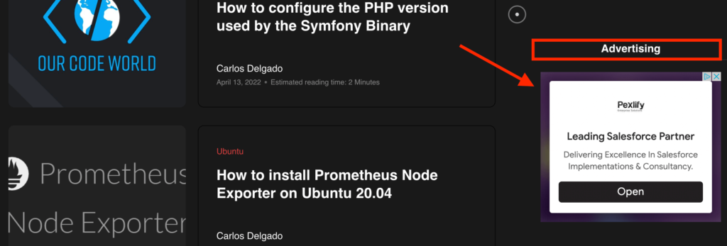
For example, it might be a good idea to keep ads in a separate column from the content (so-called whitespace). Ads in these placements can capture users’ attention without being interruptive to the main content.
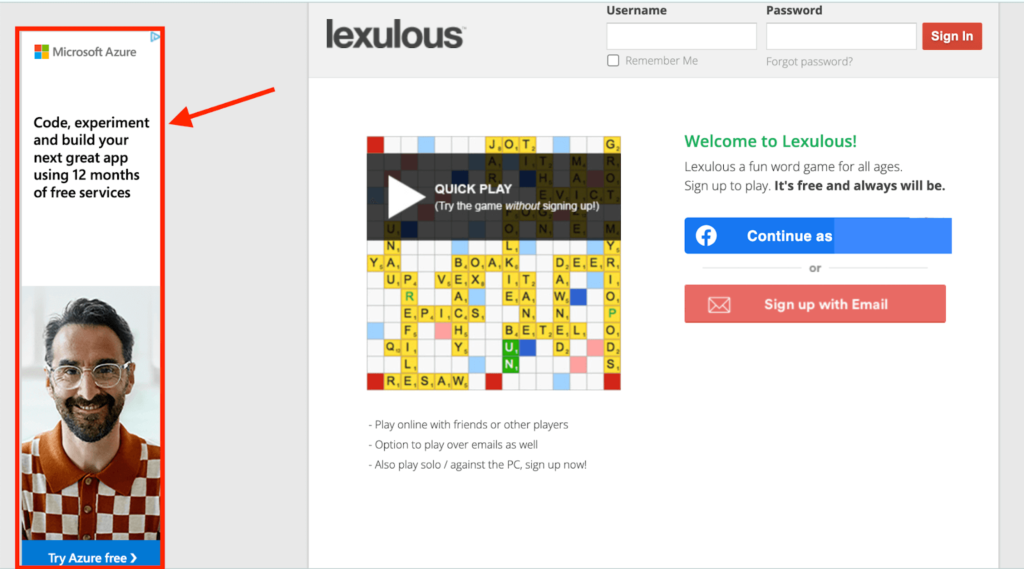
It’s also a good idea to make sure ads are clearly distinguishable from the rest of the content. This can be done by placing an “advertising” text above the banner or increasing the padding.
2. Opt-In For Advanced Ad Formats
As mentioned, sidebar banners are one of the top-performing ad placements. In fact, the most viewable position for an ad is ATF on the right side.
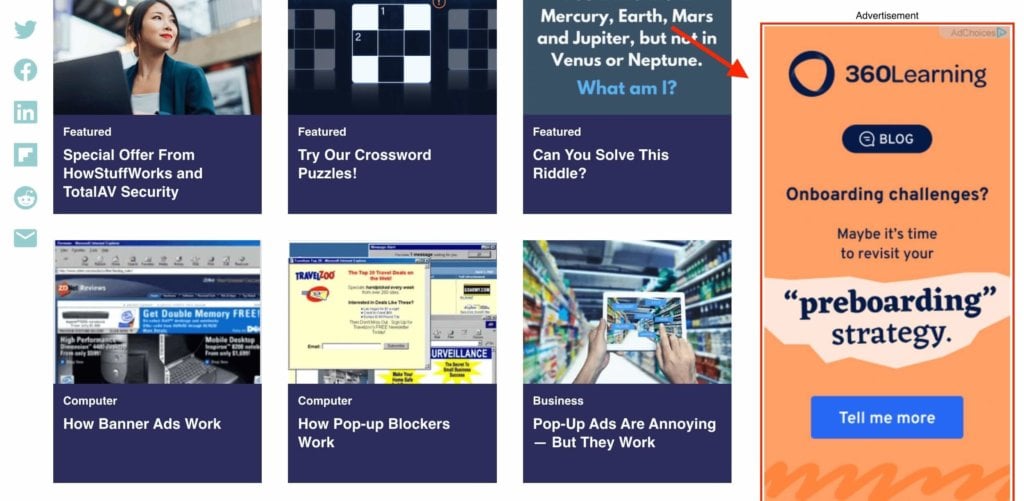
However, to improve viewability even further, consider sticky sidebar banners. They stick to the viewport and stay in view for the whole visit duration. When used with a smart ad refresh mechanism, sticky sidebar ads can generate extra revenue for the publisher.
Related Article: Acapellas.eu–Placing Sticky Sidebar Ads Increased Ad Revenue
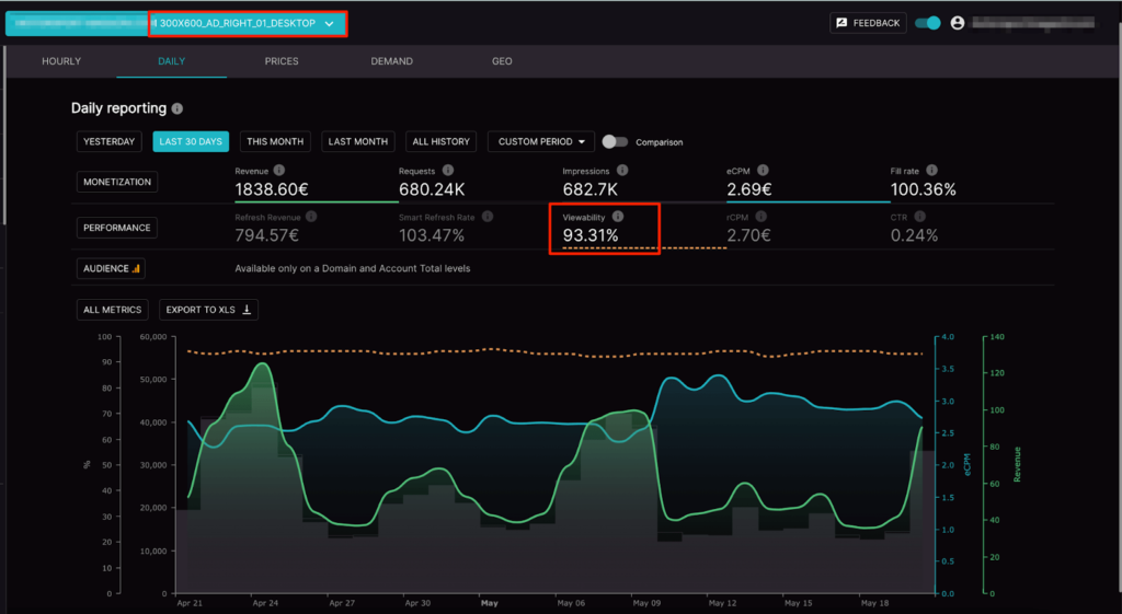
The graph below shows that the 300×600 right sidebar banner has a viewability of 93.31% for one of our clients, which is above the industry average.
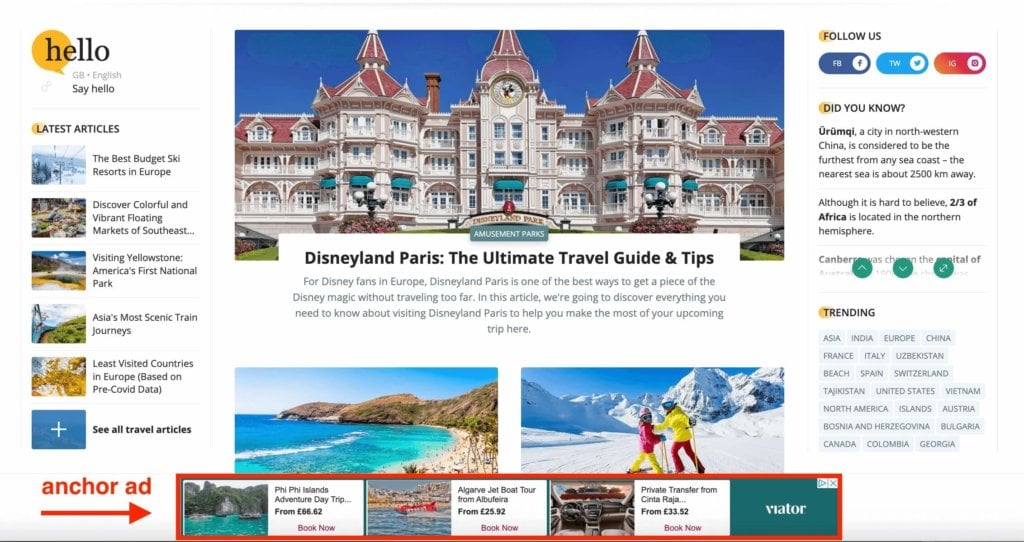
Another advanced ad format is anchor ads. As the name suggests, they stick to the bottom viewport and remain in view for the whole visit duration. The main difference between sticky sidebars and anchor ads is that anchor ads are horizontally oriented, while sticky are vertical.
For desktop, you typically see anchor ads on the top, while for mobile, you might see anchor ads on the top or sticky anchor ads on the bottom.
3. Analyze the Most Engaging Parts of Your Website
Heatmap tools like Hotjar can be effective in analyzing your website and finding the most engaging areas on your page. Later on, you can use these insights to make ad placement optimization.

4. Analyze Your Traffic
Google Analytics can give you a good idea about which pages perform better than others. It can be beneficial if your strategy is to show ads on specific pages or reserve high-earning pages for direct deals.
Your overall traffic picture can help you choose ad formats and sizes that are popular in the region where the majority of your audience comes from. Similarly, you can also avoid ad formats that aren’t supported in certain regions.

5. Keep An Eye On Your Reports
If you’re using Google Ad Manager, you can pull out the report with the most popular ad sizes and types of ad inventory. This will help you decide which ad units are worth keeping and which aren’t. Similarly, you can run A/B tests or ask your monetization partner to do it for you.
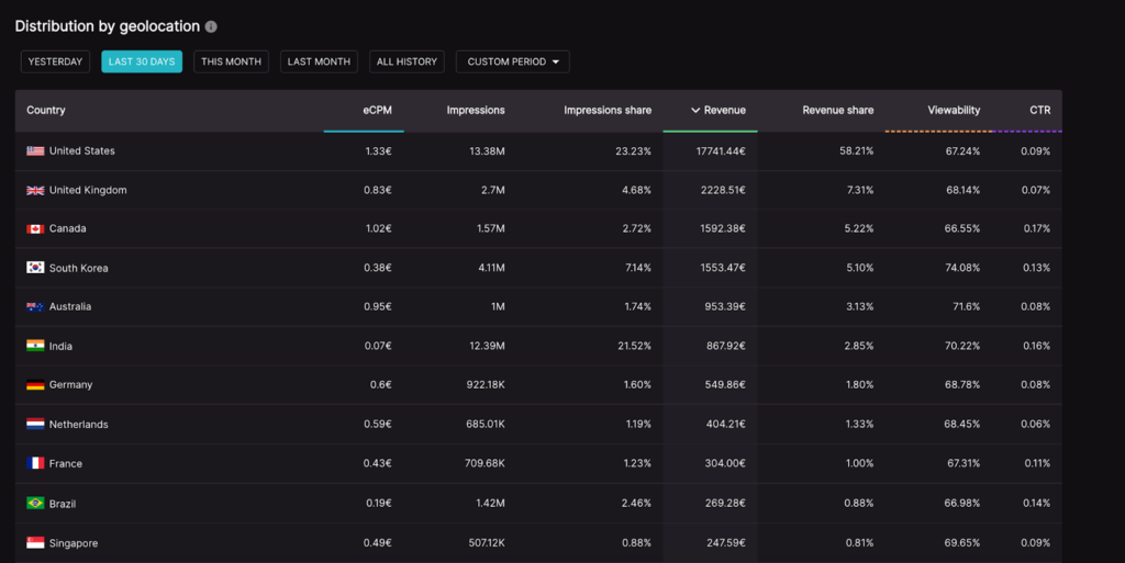
If you’re a Setupad client, our intuitive and rich dashboard will provide insights into important monetization metrics, such as ad eCPM, rCPM, ad viewability, CTR, as well as distribution of traffic by geolocation.
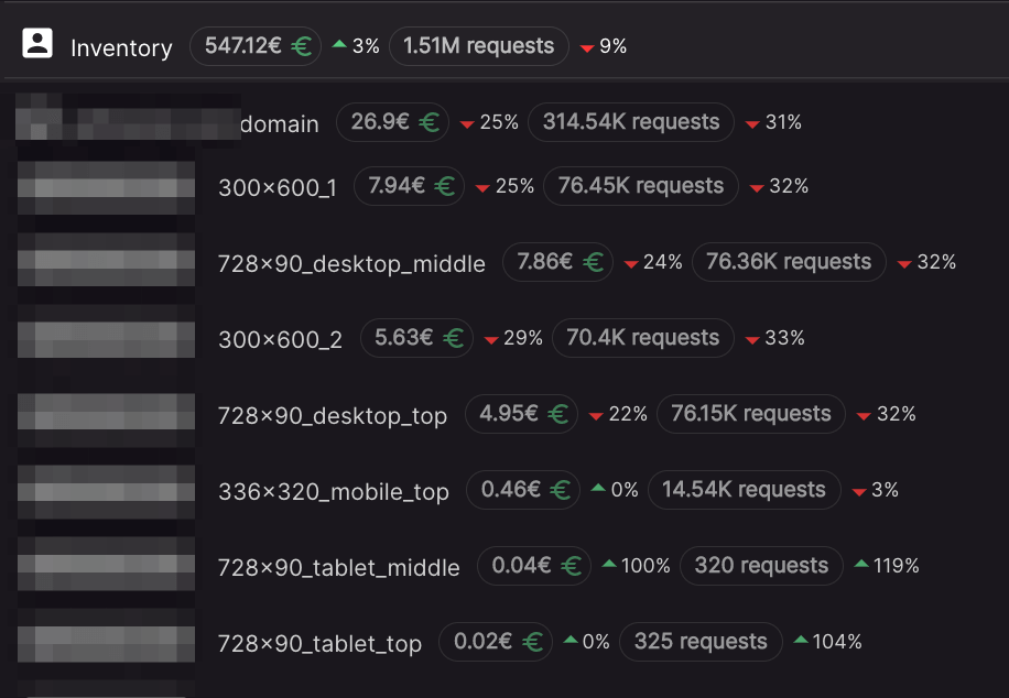
Moreover, you can check the performance and exact earnings of each ad unit individually.
6. Use Best-Performing Ad Sizes
You should pay attention to the sizes of your ads. For example, you may be tempted to use a 970×250 billboard. However, the supply for this ad size is limited. A more popular ad size would be 728×90.

It’s advised to use popular ad sizes with large demand from advertisers in order to not diminish your fill rate.
Alvils Karlštrems, Head of Ad Operations at Setupad: “We at Setupad will be able to advise on the best ad formats and sizes, taking into account your website web design and layout. While there may be more popular ad sizes, it doesn’t mean they’ll always perform the best in your case. A lot of the time, it depends on what SSPs may be able offer and what the demand is from the advertisers. So, instead of blindly going for the most popular ad size, trust your partner’s expertise.”
Best Display Ad Sizes
Based on Setupad data, the most popular display ad sizes for desktop are the following:
- Anchor ads: 970×90, 728×90, 970×50, 1000×100
- Sidebar ads: 300×600, 160×600, 300×250, 1200×600
- Billboard ads: 970×90, 728×90, 970×250, 970×200, 980×300
Note that the most popular ad sizes for mobile will differ.
Conclusion
Remember, adding more ads to your website doesn’t mean you’ll earn more ad revenue. If your user experience is poor, users will leave the site and won’t have a chance to interact with your ads.
On the contrary, if you create high-quality content and show just the right amount of ads, users will spend more time on your site.
Before experimenting with your ad placements, make sure you comply with Google policies and those of your partner (already taken care of if you’re a Setupad client).
And remember, no ad placement will instantly bring you the ad revenue you desire. Your ad optimization strategy should involve A/B testing, ad performance evaluation, and getting rid of low-performing ad units.
If you need help with your ad placement strategy, sign up with Setupad or shoot us an email at [email protected].


