
5 SEO-Friendly Technologies To Build Responsive Websites
In today’s digital age, where mobile devices reign supreme, implementing a responsive web design has become an essential aspect of web development. It helps businesses remain competitive and improve user engagement and conversion rates.
In this article, we’ll introduce you to 5 key technologies to build responsive websites and improve your search engine presence.
What is Responsive Web Design?
Responsive web design is an approach to building websites that ensures optimal viewing experiences across various devices, including desktops, laptops, tablets, and smartphones. In simpler terms, it is a design approach that allows web pages to automatically adjust according to their screen size, providing a seamless and consistent user experience.
A responsive web design involves using a mix of flexible grids and layouts. Scalable images, assets, and CSS media queries to adjust the site’s layout, content, and functionality to fit the viewing device. This ensures that users can easily access and navigate the site without zooming in or out manually, regardless of the used device.
Why is it necessary, you may ask? As of May 2023, mobile accounts for 51.52% of all internet searches worldwide. With Google’s shift to a “mobile-first” strategy, it remains more important than ever to deliver a seamless mobile experience to get your content in front of the users.
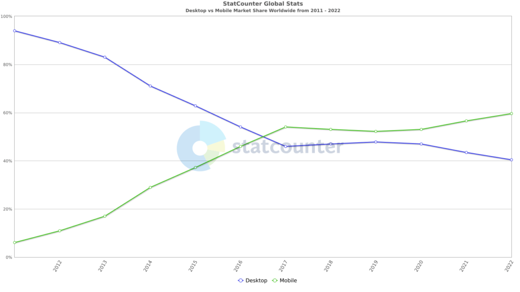
Source: StatCounter
There are many SEO-friendly technologies that can support publishers in building responsive websites. Here are 5 essential SEO technologies that you can be utilized.
5 SEO Technologies to Build Responsive Websites
1. CSS and HTML
You should probably start studying CSS once you’ve acquired a basic understanding of HTML. CSS, also known as Cascading Style Sheets, is used to customize HTML elements. 91.6% of websites employ HTML5 as their primary markup language.
HTML provides the structure and content of a webpage, while CSS adds styling and layout to that content. Together, they help create responsive web design by allowing developers to design different layouts and styles for different devices based on screen sizes, resolutions, and other factors. It helps the webpage to have structured content, easy accessibility, and boast structured content.
Using CSS and HTML for responsive web designs, the developers can create visually appealing and user-friendly websites optimized for different devices and platforms. Even though all of this may seem quite complicated, there are many paid and free online tutorials that can assist you in quickly creating picture hover effects, page transitions, and CSS text effects.
2. Web Development Frameworks
Web development framework is a collection of instruments and assets used by software programmers to build and maintain websites and web applications. These frameworks enable developers to start work while avoiding the repetitive activities needed for every project. The most remarkable ones are listed below:
- Angular
Angular is one of the most recent web technologies developed especially for creating dynamic web applications. With Angular frameworks, you can develop front-end applications without additional plugins or frameworks.
One of Angular’s most appealing features is its two-way bindings with MVC architecture, which is used to provide information to users and let them modify the data straight from the application’s user interface (UI).
Code Splitting for lazy loading of on-demand modules, well-designed templates, and code generation are some of Angular’s features. This leads to responsive layouts, speed, provides a set of built-in directives, and dynamic optimization of web pages.
- Dot Net
The .NET system has tools, libraries, and languages that facilitate the creation of contemporary, scalable, and high-performance websites.
One of the main reasons why Dot NET is so popular in the creation of online applications is that it can function on numerous platforms and architectures. This implies that you can create a website that can run on several platforms, including x86 and ARM, Windows, Linux, and macOS.
- Vue.js
Vue.js is a library that enables you to utilize HTML to build widgets, components, and other features that can be reused across several pages or applications. For those who have never used a framework earlier, the library is lightweight and simple to learn.
The single-file component-based architecture of Vue js, which is built on HTML, CSS, and JavaScript, is one of its main advantages. This makes life simple for developers because each component can be tested independently, and the coding is simple enough for programmers to comprehend. This can help save both time and effort for the developers. Thus, this aids in building responsive and mobile-first websites.
- Next.js
This framework provides the ideal network for web application development for everyone who needs to create APIs and apps as soon as feasible. Next.js will split your code into smaller bundles which can be quickly downloaded over 3G or 4G data networks, helping to reduce data usage and speed up mobile browsing.
Next.js allows writing CSS within a React component instead of a standalone file, making it easier to manage styles across multiple components. This framework also improves the initial loading speed of a web page and provides users with an interactive experience. You may utilize Next to create e-commerce apps, marketing websites, or straightforward landing pages.
3. Optimized Voice Search
With the advancement of AI, ML, and NLP, voice searches have become a popular trend evolving from Automatic Speech Recognition to voice and language understanding. In fact, 71% of consumers prefer voice search to typing.
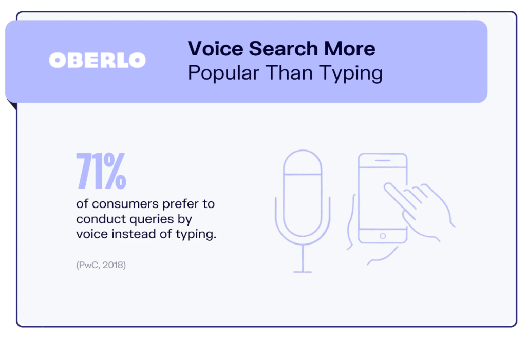
Source: Oberlo
When one conducts a voice search, these technologies use search engines as their source of knowledge. The rise of intelligent devices at home, car, or mobile with smart assistants like Cortana, Siri, or Alexa can be leveraged with the content interpretation of your website specifically tailored for voice searches.
You can use more specific conversational keywords and phrases or even full sentences in some cases; dialogue patterns, including FAQs, TTS (text-to-speech software) functions, and AI turning your content multilingual, your site ranks with localized real-time results. Notably, 40% of voice results emerge from featured snippets and load 52% faster than average results.
Thus, including optimized voice searches undoubtedly boost your SEO rankings with real-time data search.
4. AI Chat Bots
When placed on a company website, chatbots are customer support machines that simultaneously handle thousands of routine inquiries while eliminating the immediate need for live agents.
The marketing and sales funnel your team established for them in the chatbot is navigated by clients using conversational AI chatbots that can operate in various languages. Bots anticipate successfully matching user behavior to accomplish this by utilizing technology like Natural Language Processing (NLP), Machine Learning (ML), and Information Retrieval (IR) techniques.
NLP allows the chatbot to understand the intent behind a user’s query. The chatbot can then use ML algorithms to learn from past user interactions and improve its understanding of language nuances.
IR techniques allow the chatbot to retrieve relevant information from a large corpus of data based on a user’s query. The chatbot can leverage ML algorithms to analyze the user’s historical interactions to personalize the information it provides.
5. Responsive Images
The use of responsive images allows the browser to serve images that are appropriate for the user’s screen size and capabilities. It can help reduce the file size for each image and improve page load times, especially on slower network connections.
Moreover, Google uses mobile-first indexing, which means that search engine robots will only crawl and index the mobile version of a website. If an image is not helpful on mobile devices, the page could not rank as well as it could in search results.
This is why it is crucial to have responsive photos since they allow us to give the ideal file size and the correct image for the suitable resolution that enhances user experience and speeds up loading.
Ending Note
A responsive design prioritizes users, makes it simple for them to interact with your website, and signals to Google that your website is optimized for search on all devices. Starting with a planned web design will also enable you to create a fully optimized structure that is simple to use on any device.
The above-mentioned SEO-friendly technologies will help you build responsive websites ensuring that you stay on top of your game. You can build a responsive webpage that is effective and simple to maintain with these SEO-friendly technologies.


